Showing posts with label Distress Inks by Ranger. Show all posts

Friday, July 3, 2015

Summertime

What says summer better than the colors of Yellow and Green.  Yellow represents the sunshine and Green represents the grass (that keeps growing and needing to be mowed) and birds - birds who wake up singing at the crack of dawn.  They are so happy.

I combined several challenges for this card.


Simon Says Stamp Wednesday Challenge - We're Going Dotty  


The background was made with a yellow gelato and Green Grass distress ink.  I scribbled the gelato on my sheet and added water.  I dipped the watercolor paper in it.  The distress ink was done the same way.  You needed to let them dry between dippings.  I believe I came back and redipped the yellow so it was a little brighter.  The cute little birdie was stamped on gessoed book pages and colored with distress paints.  He was cut out and glued to the panel.  Googly eyes were added with glossy accents.  The ribbon was dyed with the distress inks also.  The dots are embossing paste - the dots add just a little contrast to the green/yellow back ground.  Everything was matted with dark grey cardstock.  

I hope you are enjoying your summer.  Thanks for stopping by.  

Friday, April 3, 2015

Christmas ATC

I have found a new love for creating.  It is tiny pieces of art called ATC's.  They measure 2.5  x  3.5.  They are very fun to do.  I also found an ATC challenge site so I am going to try and play along each week.  The site is called Wicked Wednesday ATC.

The challenge this week is April Fools Day or your favorite holiday.  I chose to go with Christmas.


I dug through my box of backgrounds I have made and found this pretty blue.  I believe it was made with distress inks.  The little stamp is made by Hampton Art.  I inked the stamp with VersaMark Ink and Black Versafine Ink.  I then put clear embossing powder over the top.  The little penguin and sentiment really pop and shine.  The beak and flippers were colored with distress ink.  Glossy accents was added tot he eyes.  I matted the image on black card stock to frame it.  I added a strip of patterned paper on the side.  I thought it needed a little bit of something.  I also randomly colored some of the squares with blue distress paint.  The stars and circles were punched out of silver paper that I made.  I rubbed VersaMark ink along a piece of paper and then added silver embossing powder.   You now have Silver paper.  A few rub ons were added along with some small enamel dots.

Everyone enjoy your Friday.  I am not working today so that is a plus to start the day.

Wednesday, February 4, 2015

Blue Bird of Happiness

I am in love with this bird stamp and I have only used the one bird - there are three more to use.  The stamp is by Dina Wakely for Ranger.  It is called Scribbly Birds.

On Sunday I shared a canvas I made with the bird and one of the sentiments, but there was this saying going through my head when I painted the bird blue - blue bird of happiness.  Inside the sentiment says "so blank blank blank be happy".  I think I will add happy valentine's day.  I think it would make a few people smile.


Did you notice his/her heart is broken?  I have never had my texture paste do that before.  Maybe there is something very symbolic in this.  The card front is made on mixed media paper with layers of gelatos, acrylic paint, texture paste, distress ink, regular ink, gel medium, and gessoed dictionary pages.

I am going to enter this in the weekly challenge on Monday's Simon Says Stamp.  The challenge is "H is for" - well for me it could be happiness or for those three little red hearts.

Thanks for stopping by and enjoying my humor - hey another H.

Sunday, July 13, 2014

Mixed Media Retirement Card

I found a new challenge site that does a monthly challenge and it has to do with Mixed Media.  I love to play with Mixed Media.  I have made canvases, ornaments and cards.  I make mostly cards so The Mixed Media Card Challenge blog was made for me.   The cue word for the challenge is nature.

I needed a retirement card for someone on campus who is retiring to start a new adventure with a company in Florida.  I wanted to wish her well and thank her.  I returned to school in my 40's to finish my degree. Chris was the instructor for the two main classes in my major.  She made me stretch my abilities as a student. I am sure she regretted that several times when she had to read the papers I had to write for each class. One paper was 50 pages long.


My card has a background made with distress inks on watercolor.  I swiped the inks on my craft sheet and added water to them and then dunked my paper in the ink/water mixture.  The green was a little muddy so I used my green gelato and added it to the green sections to brighten the color.  The flower stamp is from Hero Arts.  They were colored with a variety of mediums.  Watercolor pencils and distress inks.  I may still add some glitter to the flowers.  It was supposed to be a flower on a stem but I did not like that so please do not look under the flowers.  The top flower is pop dotted for dimension.  I used embossing paste and a Hero Arts stencil to add the colored dots.  I put the embossing paste on a piece of wax paper and then dabbed some distress paints next to it to color the white embossing paste.  I didn't want the dots to jump off the page; I wanted them to blend more with the background.  I think I achieved the right color.  The embossing paste dots made me like the card.  I just new stuff in the mail yesterday and this banner die and sentiment from Simon Says perfectly finished the card.  It is also pop dotted.  The pearls and enamel dots were added around the card to put something in the empty spaces.


I hope you enjoy my mixed media retirement card.  Thanks for the great challenge.

Tuesday, July 8, 2014

Keep It Simple and Mash It Up

Doesn't that Title sound like a good idea for dinner.  Hmmm - mashed potatoes and some chicken.  Oops - I digress - we are talking about card making and two different challenges.

I just found another new challenge called Keep It Simple.  Their challenge for the last two weeks is


Turquoise is one of my favorite colors.

The challenge at The Friday Mashup is color wash and a CAS project with minimal layers.

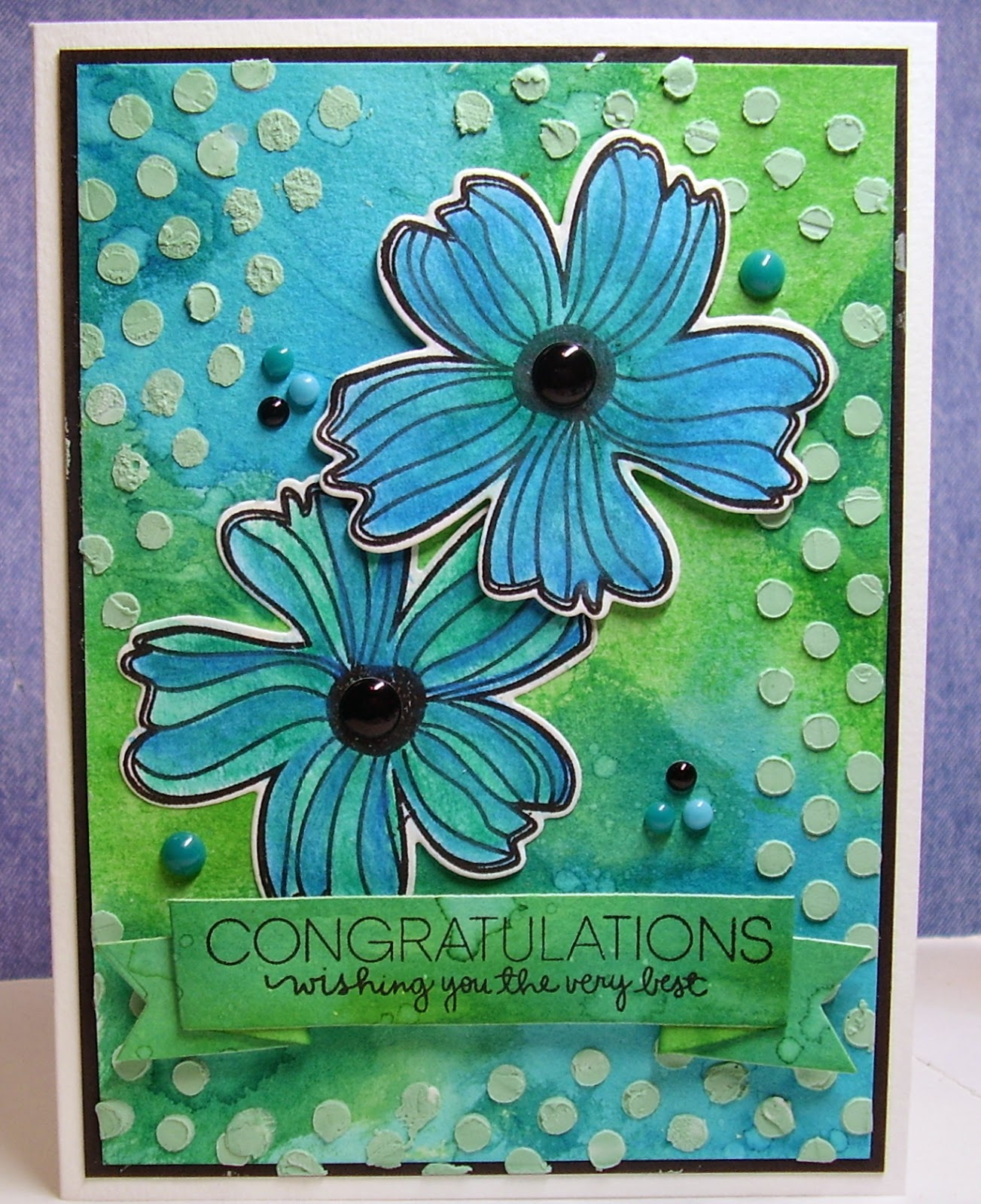
I dug out my distress inks and starting making color wash backgrounds.  I smooshed the ink on my work area and spritzed it with water.  I also spritzed the watercolor paper and then put the water in the distress ink.  On the Sympathy card, I rolled the ink around so that I pooled ink in some of the areas of the paper so it got a darker in some areas.  I really like how it turned out.  The birthday card started the same way but I got a more even color on this panel.  While the panel was still wet, I sprinkled salt on top and let it dry.  Once dry, you brush the salt away.  It gives a great finish to the color washed panel.   I am entering one of my cards in the challenge on Addicted to Rubber Stamps challenge to Make Your Mark - well I made my own color wash paper.  Hope that counts.


I used the same stamp set from Hero Arts on the cards.  The birthday card uses the outline stamp.  I then colored the flower in the distress ink.  When you use the distress ink without water, it gives you a deep rich color on the flowers.  I added some black gems in the center.


I stamped the flower on this card with the stamp that gives you the all over color.  Sorry the proper name escapes my mind.  I matted the image.  On this card I cut the top edge shorter than the back.  I lined the inside of the card with the same color as the mat.  It makes a very pretty card but it is very hard to photograph.  I added clear gems to the center of the flowers.

Both cards have a embossed background (white on white).  All the white in the cards, is recycled cardstock.  The sentiments are SRM Stickers.  I just cut off an edge on each color washed panel to get a strip that matched the cards.

Sorry for the long post.  I actually have one more card with the same color wash and flower stamp.

Thanks for the great challenges.  I am happy I was able to combine them and also I now have a sympathy card for my own supplies and a belated birthday card.  Numerous people could receive this card since I am a little behind on my birthday cards.

Saturday, May 10, 2014

Watercolor Hero Card


As I have been sharing my cards you all know I am taking the watercolor class.  I have been making backgrounds with distress inks and stencils.  How exciting that the challenge on The Friday Mashup is to use a stencil.  Unfortunately I do not know who makes the stencil.  I colored the twine with distress inks also.  I also made my own paper to match using distress inks for the mat and the sentiment.  The stars were cut with a Spellbinders set.


The challenge on the Paper Smooches Sparks Challenge blog is Anything Goes.


I decided to use the background to make a Hero Card.  I will write a note in the card to one of our Heroes who are serving overseas.  It will go in my next Operation Write Home box.  The sentiment stamp is from Paper Smooches - a stamp set which part of the proceeds goes to Operation Write Home.  Thank you Paper Smooches for supporting our Heroes keep in touch with their families and friends at home.

If you want to buy your own Paper Smooches stamps, pop over to their online store.

If you are interested, pop over to this post and see how different this very same stencil and different inks look.

I am so glad it is the week end.  I hope to play more with watercolor stuff.

Friday, May 9, 2014

Watercolor Background Card


Here is another card I made for my watercolor class.  I made the background with distress inks and water on watercolor paper.  I saturated the paper with water and light wash of ink.  You then put a stencil over the top and the water is supposed to pool in the holes.  I sorta did not think it had enough color so put more watered down distress ink in the holes of the stencil.  I really like the muted soft background I achieved.  You will have to come back and see some other cards using the same technique and stencil - how different they turned out.  Unfortunately I have no idea who made the stencil - no name on it.

The stamp set is from Unity Stamps.  There were butterflies in the stamp set and if you look you can see some muted stamped ones in the background.  I punched out two butterflies.  One I colored with the distress ink and glued down - shhh - don't tell anyone - there is a bird underneath that butterfly.  The other one is punched from the cardstock of the card base.  I have seen all these cards made with the image off center so I wanted to try that.  I added a few pearls to the card.

Thursday, May 8, 2014

Watercolor Class

I am taking the watercolor class from "online card classes".  Having lots of fun.  I haven't gotten past the first two days of class in creating - we learned how to do different backgrounds.  I have been having so much fun I may never do any other cards.

This card is made by putting ink on an acrylic block and then stamping it on watercolor paper.  I used distress inks for this card.  I did this a couple nights ago - hmmmmm - how did I do that?  I must have wet something down - maybe the paper.  This is a very small card - it only measures 2.5 inches by almost 4 inches.  I decided to put my sentiment at an angle.  something a little different.

Come back tomorrow to see another technique.

Wednesday, March 21, 2012

Sympathy Cards


I find that Sympathy cards are so difficult to make - and they are not a card I can make ahead of time.  I do try to make them somewhat personal.  I struggled for several days making this card and I don't know if I am totally happy with it yet. 

I love the background.  I stamped the Hero Arts background stamp in VersaMark and then clear embossed it.  I then rubbed distress inks over it - Blues and greens - to try and give it a tealish color.  I matted it with a dark navy metallic paper.  The sentiment - another Hero Arts Stamp - was stamped on a scrap of the patterned paper I stamped the background on.  It was matted with the navy blue also.  I had this Bazzill bling paper that picked up the blue/green undertones.  The background and sentiment are both pop dotted. 

The flower is made from coffee filters which I cut out with spellbinders - there are four layers of four different sizes that make up the flower.  I colored the coffee filters with distress inks and Perfect Pearl Mists.  I bunched them all up - put a rubber band around them and let them dry for 24 hours.  The ribbon is from my friend Ivanka.

Moxie Fab World has a challenge to use household items on a card - well coffee filters are a household item.  The actually make great flowers and take color from many different mediums.  I will also place it in the Hero Arts monthly challenge for flowers.

Now I need to finish the inside of the card.  I think I then need to just make a card that is not so difficult to design.  Do you struggle making sympathy cards?

Friday, March 9, 2012

Clean and Simple


A quick post for tonight - trying to get some quick mo jo running through the fingers.  CAS-ual Fridays has a great post to use a Sentiment on your CAS card.  I think ths qualifies.   

The background is stamped with a Hero Arts stamp (friend) with a Distress Ink.  The branch (sorry it is loose floating around my table so I don't know who makes it) stamped with Memento Ink and the sentiment is from Hero Arts and it was stamped with Colorbox Chalk Ink..  This is a CASE from one the Paper Crafts special editions but I ended up matting the background and sentiment.  The sentiment was also pop dotted. Of course, you need to add a little inking with a light brown chalk ink around the edge of everything. 

I bought a big pad of watercolor paper at Hobby Lobby to use for these card bases.  The paper will give the card a good weight.  Single layer cards scare me very much.

Thanks for stopping by.


Sunday, October 16, 2011

Unity Stamps Fall Card


I wanted towork on a few Fall/Thanksgiving cards since I will be gone for a couple weeks before Thanksgiving - I don't spend the day with my girls so like to send them each a card to let them know how blessed I am to have them as my daughers and their great husbands as my sons

This card used some of the techniques I learned on an online class Jennifer McGuire taught.  I embossed the image on watercolor paper.  Swiped 3 or 4 distress inks on my mat and sprayed with pearl ex.  I then stired them together to get this fallish color.  Of course I will never replicate it again.  I like how it turned out.  The pearl ex adds so much beautiful shine to the image.  The bow is some fabric left from a valance I made my neighbor.  The colors worked perfectly.  I love to use fabric for a bow.  The paper is from a collection found at Hobby Lobby - they have added some new groupings that are a very nice weight. 

This card is based on the sketch at Card Patterns and the challenge at Unity Stamps to make a fall card. 

Everyone enjoy your day.

Saturday, October 15, 2011

Penny Black + Distress Ink = Beautiful


Playing with ink this morning and my fingers show it.  I had purchased this new Penny Black stamp and wanted to play with it - Penny Black's weekly challenge is using inks to make a dusky sky - my sky is blue - hopefully it works for their challenge. 

I first inked my stamp with Versamark and then with Distress Ink Black Soot and stamped on white paper.  I then placed clear embossing powder over the top.  I then took distress inks to color the paper the image was stamped on.  I first used Broken China and then added some Fades Jeans.  I have found I can never usually find a perfect color to work on the card so I just make my own paper and color it with the same inks.  Black card base and black mat provide the perfect contrast.  I added a black brad in one corner to balance the twine bow in the opposite corner.

Since the card is for my personal use - I added clear Stickles in the mood and across the words - very subtle - and I made my paper for the inside and stamped a sentiment - card is ready to go - now who will receive it will be the question - I think it should be someone who will appreciate all the technique that went into the card.

I am loving Saturday - I need to go do some cleaning/clearing.

Sunday, October 2, 2011

My Mind's Eye, Stampendous, SRM Stickers Unite

If you are looking for the blog hop post, click here.


My card today is based on the sketch at Stars and Stamps - OWH's card blog.  Every Sunday there is a new sketch.  I was doing a little experimenting with embossing and dye inks.  The stamped the image in Versamark, embossed with white embossing powder and then rubbed distress ink over the piece of paper.  I tried to add an edge of white embossing along the very edge also.  I added the sticker in the corner - OWH is always in need of thank you cards.

I am not quite sure about my choice of papers. 

Everyone have a wonderful evening - I am channel hopping - Packers/Brewers - both are winning presently - hope it stays that way.  

Tuesday, September 20, 2011

Faux Letterpress Technique


A quick post today - I wanted to share a couple cards I made using the Faux Letterpress Technique.  I am taking an onlien class - Inspiration Showcase with Jennifer McGuire.  I am learning so much - and will take another class sometime like this - I already have 80 some pages of printed material from the class with beautiful examples. 


With this technique you ink of one side of your embossing folder and run it through your machine.  Clean your embossing folder.  Ink the other side and run it through the machine.  You could just do one piece of the embossed paper on a card but I chose on these two cards to cut the pieces and then was able to make two cards.  I thought they turned out fallish looking with the leaves and goldish ink.  This sentiment from Hero Arts has become a favorite for cards for Operation Write Home - sometimes it is not a special occasion - you just want to say Hello. 

Thanks for stopping by.

Saturday, September 17, 2011

Hero Arts and Canvas Resist


Good morning - wanted to share this card I made.  I am taking an online class from Inspiration Showcase with Jennifer McGuire.  I am having so much fun - trying things I would not normally do - so this is good for me - plus I am getting some cards made for some upcoming and belated birthdays.

This card is done using the Canvas Resist Technique.  I did not have any sheets of the sticky back canvas so I do have just regular canvas bought at the fabric store.  I tore the size I needed to fit my stamp.  The tearing gives it such a nice homespun look.  I rather like this and think it would be a beautiful piece of artwork also.  You ink your stamp with Versamark and stamp on your fabric and then emboss it with white embossing ink.  After that you press your distress ink over the entire piece of fabric.  You can mist it with a Perfect Pearl Powder and water mix to make the ink go into the fibers of the canvas better.  You then wipe off the embossed areas with a damp cloth.  Such a pretty effect and the colors are varied even though you used the same distress ink. 

I am going to enter this card at Lily Pad Cards because they have a Resist challenge going on - they must have planned it around my taking of the class.

Now I am still working on Day 1 of the class - we are up to Day 6.  I am so behind.

Everyone have a very creative day.